DAVID BIANCULLI

Founder / Editor

ERIC GOULD

Associate Editor

LINDA DONOVAN

Assistant Editor

Contributors

ALEX STRACHAN

MIKE HUGHES

KIM AKASS

MONIQUE NAZARETH

ROGER CATLIN

GARY EDGERTON

TOM BRINKMOELLER

GERALD JORDAN

NOEL HOLSTON


No, You're Not Delusional -- The TV in TV Worth Watching Is Flickering On!
July 29, 2008  | By David Bianculli
 

Part of me wanted to say nothing, so you'd all think you'd gone mad... especially since, until and unless a few more bugs are worked out, it may be a one-time thing. But today, TV WORTH WATCHING finally implemented something my website designer, Eric Gould of Helicon Design, worked up a few months ago.

tv-worth-watching-tv.jpg

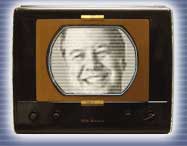
Namely, that the TV in the banner logo on the main page of TV WORTH WATCHING -- the one with my picture -- now flickers on, and rolls horizontally a couple times, the way the old, cranky, over-the-air TV sets used to do.

As someone who is old, cranky and over-the-hill myself, I find this little animated visual endlessly amusing.

But it turns out, for now, it's NOT endlessly, at least for some people with some computers. For them, for now, the animation gets stored in some cache somewhere after a single usage, and won't reappear. It's up to my website computer guru, Rich Baniewicz, to figure this one out. So if you saw the TV flickering once, and never again, you're not crazy.

But maybe I am, for launching a website in the first place. Changes are happening slowly here because I'm also a) working for Fresh Air with Terry Gross, b) becoming a full-time college professor in a month, and c) having to write my Smothers Brothers book by November. But I love what this website is becoming, and especially the readership it's attracting, so I'm doing what I can, when I can, to make changes and additions.

While we're on the topic, I may as well ask: I have two ideas regarding the daily BEST BETS, which, along with BIANCULLI'S BLOG, I consider the cornerstones of this website.

One idea is to have only the photos, titles and times of the six chosen daily shows on the main page, with a handy click-to-read button to go to a separate page where I've written my reviews of each program. On the main navigation bar, you can click on BEST BETS now to see what that would look like. But I'm afraid of doing that if readers won't click through to the reviews, so I'll be writing for nothing. (And not just monetarily.)

primetime-randy-pausch.jpg

The other idea is to have, on the main page, an EVERYBODY'S A CRITIC feature, where you could write in -- as you do now with comments on the blog -- and weigh in on what you liked, or didn't like, about something recommended in BEST BETS, or elsewhere on the site. For example, if you watched tonight's ABC Primetime special on Randy Pausch and were moved by it, it'd be a place to say so.

So, once again, I ask to be guided by my own readership. Should I keep BEST BETS intact on the main page, or have it bounce to a new page as does the daily blog? And would you welcome the opportunity to post your own reactions to shows you've seen, or would you rather read than type?

Of course, if you hate typing, I'll never know, will I? Because you won't type to tell me so...


7 Comments


Ken R said:

You have the date wrong on today's best bets ! (Whoops! Fixed now -- Clearly, I'M the one who's delusional. Thanks. -- David B.)

Comment posted on July 29, 2008 11:09 AM


Dave said:

You should keep Best Bets as is, why make it more time consuming. Most times the Best Bets are not posted in the early morning, you should post them early like reading a morning paper. Look at today's Best Bets, Tuesday's listing but posted as Monday July 28th on the home page.

You once had a click through on Best Bets as "read more", it took readers to a blank page. Keep it simple and post it early because it must be written in advance. I would think it is your web guy who puts up the new post.

Your "Best Bets" at the Daily News were always something to look forward to, same on your web site.
Your reviews at the Daily News the same, you don't seem to review shows like you did at the newspaper, miss that on the website.

Best Bets is a cornerstone. Your reviews at the paper were a cornerstone.

Thanks.

Comment posted on July 29, 2008 11:31 AM


henri said:

tv animation: I have my browser (firefox) set to play animated images exactly once, otherwise it's just too distracting to read most of the web. looks neat though.

Best Bets: I like the short "why this episode is worth watching" blurbs on the front page, I don't think I'd be as likely to click through to see the content otherwise.

On the other hand, if there are comments sections for each day's "Best Bets" I'd be much more likely to revisit older Best Bets.

Could the comments also be used for us to point out shows that you didn't highlight as a Best Bet?


btw: the "Best Bets" link has a bug: it doesn't work when you are reading an individual blog posting

Comment posted on July 29, 2008 11:55 AM


Jim said:

Keep Best Bets as is. Maybe you could allow comments so that readers can tout their own favorites.

The most useful recommendations for me are those for relatively obscure channels, such as BBC America, which I keep forgetting I get, or VH1 Classic, which I didn't realize I got until you touted the Dylan and Joplin documentaries a week or so ago.

Comment posted on July 29, 2008 12:47 PM


Neil said:

David, if you're going to continue writing little paragraph-sized capsule previews of the six highlight shows of the day, then just leave it as it currently is. It's short and elegant and there's no latency time involved in loading another page.

However, if you're considering expanding the size of these previews, then I have a third option: have a pop-up window appear over the main page when you "mouse over" the picture/header of each item. In other words, have your six blocks of info in the Best Bets section (publicity photo, program title, network ID and show time), but when you roll your mouse cursor over that block, have a pop-up window appear to its left/right/above/below (wherever there's room) that displays your blurb about the show. When you move the cursor off the "hot zone", the pop-up goes away. And doing it this way may give you a bit more real estate in the window to increase the number of programs you highlight on any given day, without making the page more cluttered.

As for reader comments, be careful what you wish for. Just look at what the NYDN has become with reader comments after many online stories. These opportunities to comment don't necessarily attract the most thoughtful people on the planet, if you know what I mean. (Was that diplomatic enough?) (Yes, it was -- but if you've ever read the comments here of your fellow commenters, I have the utmost faith that theirs will be at least as readable and interesting as my own. -- David B.)

Comment posted on July 29, 2008 12:55 PM


Michael M. said:

The Best Bets are the reason why I keep coming back to the site, and I'm worried to have them be fiddled with at all! Keep as is.

As for the user comments, I think it would be great because I feel websites can never be too interactive, even if it draws in the occasional worthless discussion.

Comment posted on July 29, 2008 7:19 PM


Lucy said:

I'd click through to read your Best Bets reviews. With the additional space, I'd love to see 9 or 12 Best Bets. It must be difficult to pick 6 out of 400 channels.

I'm not a fan of the Everybody's a Critic idea - for the reasons Neil mentioned.

The flickering TV? Cool!

Comment posted on July 29, 2008 8:44 PM


Leave a Comment: (No HTML, 1000 chars max)
 
 Name (required)
 
 Email (required) (will not be published)
 
MSJEL
Type in the verification word shown on the image.